Seeing What the Eye Can’t
One of the most valuable products generated by these sensors is the Aerosol Index. Unlike true-color satellite imagery which can struggle to distinguish smoke or dust over bright surfaces such as clouds, snow, or ice, the AI highlights airborne particles regardless of what’s underneath.
That’s a significant advantage when you’re trying to understand how aerosols move through the environment. The image below illustrates the difference. The image on the left is a natural color view of the Northern Hemisphere from NOAA-20’s Visible Infrared Imaging Radiometric Suite (VIRS) on June 4th, 2025. Smoke from the Canadian wildfires and dust streaming from the west from the Sahara are visible, but some details are subtle.
The center image tells a different story. Using Aerosol Index data from the Ozone Mapping and Profiler Suite (OMPS), the extent of both smoke and dust becomes immediately apparent. Smoke blankets much of Canada before stretching across the Atlantic toward Europe, while Saharan dust spreads across northern Africa into the Atlantic Ocean.
Overlaying the Aerosol Index on the true-color image (right) combines the strength of both datasets, providing a clearer picture of where aerosols are, how extensive they are, and how they’re moving.
It’s important to note that the Aerosol Index detects aerosols, not their source. Additional analysis is required to determine whether a plume consists of smoke, dust, volcanic ash, or another type of airborne particle.
The Utah Fire, Seen from Space
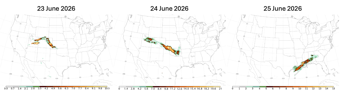
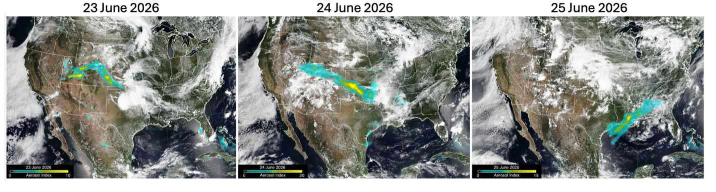
The June 2026 Utah Wildfires illustrate how satellite observations can be used to identify and follow extreme wildfire smoke over time. On June 22, an intense wildfire generated a pyrocumulonimbus (pyroCb) cloud (a thunderstorm created by the heat of a large wildfire). By following the day, NOAA-20’s OMPS instrument had captured the resulting smoke plume.
Using IDL, I mapped the footprint of every individual satellite measurement, assigning colors based on Aerosol Index values. Higher values corresponding to denser, higher-altitude smoke, making it possible to follow the plume as it dispersed over several days.
For another visualization, I used a different color palette, applied smoothing, and varied the transparency of each measurement based on Aerosol Index values before overlaying the results on natural-color imagery.
The results isn’t simply a more attractive image. It provides important context by showing where the smoke sits within the broader atmosphere and how it evolves over time. For researchers studying extreme wildfire behavior, that additional perspective can be invaluable.
Why IDL Matters
People occasionally ask whether I continue to use IDL now that I’m retired. The answer is simple: every day.
IDL has been the backbone of my scientific work throughout my career because it lets me move seamlessly from raw satellite observations to analysis and visualizations. Whether I’m calibrating satellite instruments, investigating volcanic eruptions, or tracking wildfire smoke across continents, it remains the tool I trust to answer scientific questions quickly and accurately.
Although my career with NASA has come to a close, the work hasn’t. I continue contributing imagery and analysis to the pyroCb research community, and I’m preparing to launch a blog where I’ll share satellite observations of ozone, sulfur dioxide, wildfire smoke, dust storms, and other large-scale atmospheric events.
After more than three decades, I still find it remarkable that instruments built to monitor one part of our atmosphere continue to reveal so much about the rest of it.