Projection and Purpose: The True Size of Africa
Anonym
To readers with a background in remote sensing, cartography, and GIS the map below published by Kai Krause may not be new concept but it is likely surprising. As geospatial professionals we know well the errors caused by projection distortion following the maxim: shape or area (pick one) and factor this into our consideration of whatever analytical or decision making process we are undertaking. This has at least two potential problems. Firstly acceptance of the effects of map projections are not universally known or understood. Second a dominant and persistent visual representation changes our perception of whatever it is we seek to understand so influencing decisions made using this view.
The effect is well demonstrated by the reaction to viewing this map which shows area-accurate projected countries overlaid to an outline map of Africa. In comparison to the distorted geographic projections of the familiar Mercator maps which artificially magnify the size of the Northern and Southern hemisphere countries away from the equator, the Peters projection provides an area-accurate view showing an elongated Africa, and a smaller America and China. In a straightforward way Krause visually illustrates the fact that Africa is in fact much larger than many assume.
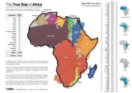
The True Size of Africa. A small contribution in the fight against Immappancy, by Kai Krause.
The discussion on the significance of this is well addressed elsewhere, but its effects are manifest with Krause indicating geographic estimates by Asian and European students to be off by a factor of 2-3 and American students over-estimating the size of their home country relative to the rest of the world. Arguments on population and population density are often similarly misplaced with actual estimates of 1bn at 65 people per square mile in Africa and 300M at 76 people per square mile in the US. Krause coined the phrase Immappancy explaining this and with this graphic shows how this misrepresentation serves not only to skew our view of the world but also our place in it.
With many now learning the size and shape of the world from Google Maps (which uses Web Mercator) on their laptops, tablets and smartphones this changed view of the world need not persist but seems likely to. We are comfortable with our accepted view and variations such as Krause's, though more accurate, can lead to uncertainty. Even with the relatively recent systems of computer mapping the fundamental problems and solutions of map projections remain as relevant today as they were hundreds of years ago.