It's Not Just Analysis, It's A Transformer!
How to make PCA, MNF, and ICA work for you
Anonym
In geospatial work we’re trying to answer questions about where things are on the earth and how they work. Exact scales and applications can vary, and there are only so many measurements we can take or how much data we can get. As a result, a lot of our work becomes getting as much information as we can and then trying to get all that different data to work together, hopefully resulting in a clear picture answering our question. Data transforms are an excellent set of tools for making lots of data help us.
Too often, information on tools and analyses are aimed at the wrong audiences, assuming the user wants to be an expert and derive the algorithm from first principles. It is important that the underpinnings and mathematical derivations analysis be open and available to anyone who needs to see them. However, often, what is needed is a clear description of how to use tools reasonably. You don’t have to know how to make wine to enjoy a glass with dinner.
There is a lot of detailed information on transforms available; this post is a summary of the important parts and difference of data transforms.
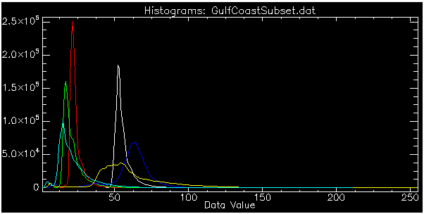
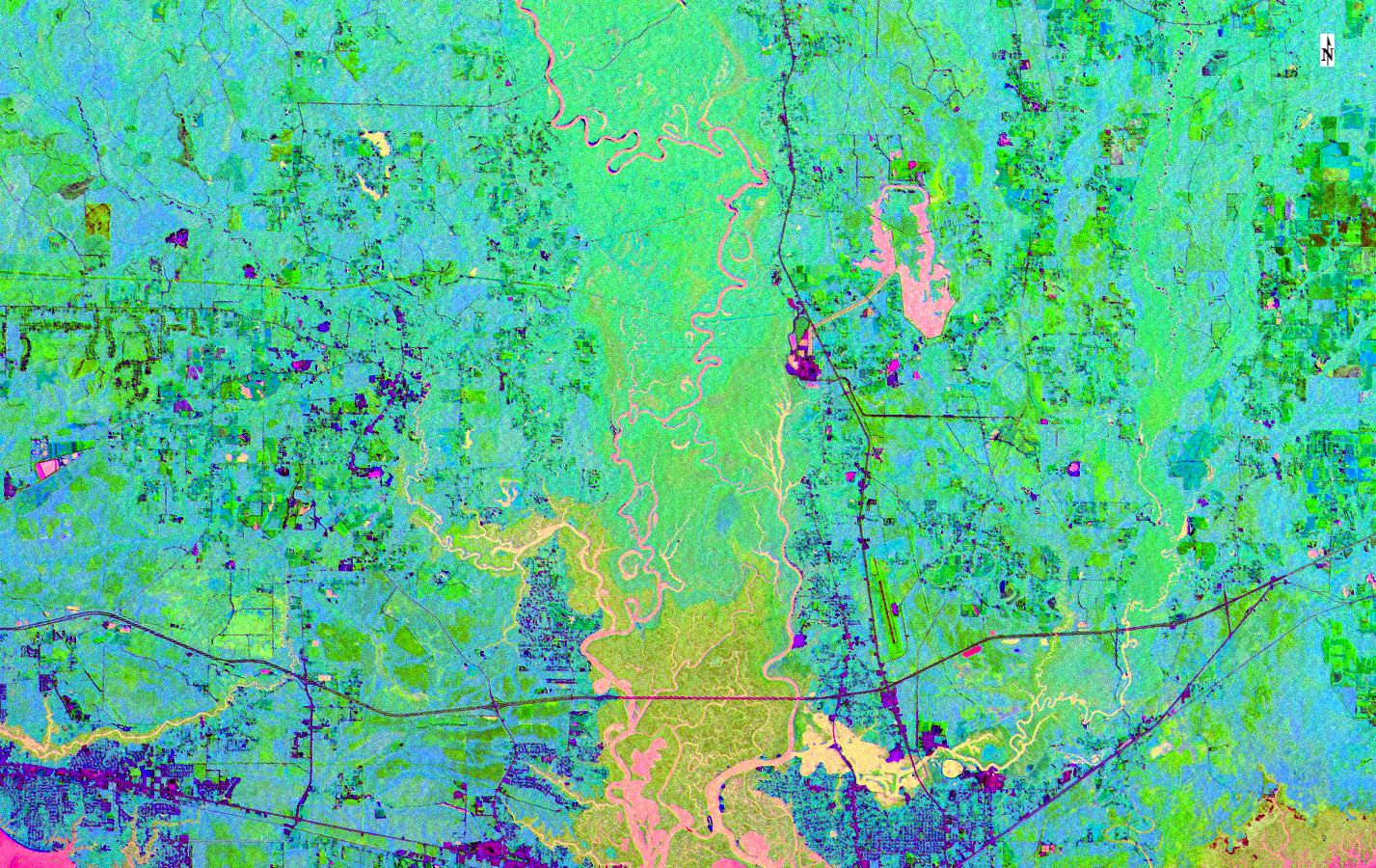
Principal Components Analysis (PCA) has been around since the early 20th century. PCA assumes we have some measurements of points we’re interested in. In image analysis it means having some number of spectral band brightnesses for each of the pixels in our image. With no prior knowledge of an answer the smart bet is “average” and PCA assumes this. Their histograms should be classic bell/Gaussian/normal-distribution-ish curves. Here are the histograms for Landsat 5 multispectral bands over a part of coastal Alabama:
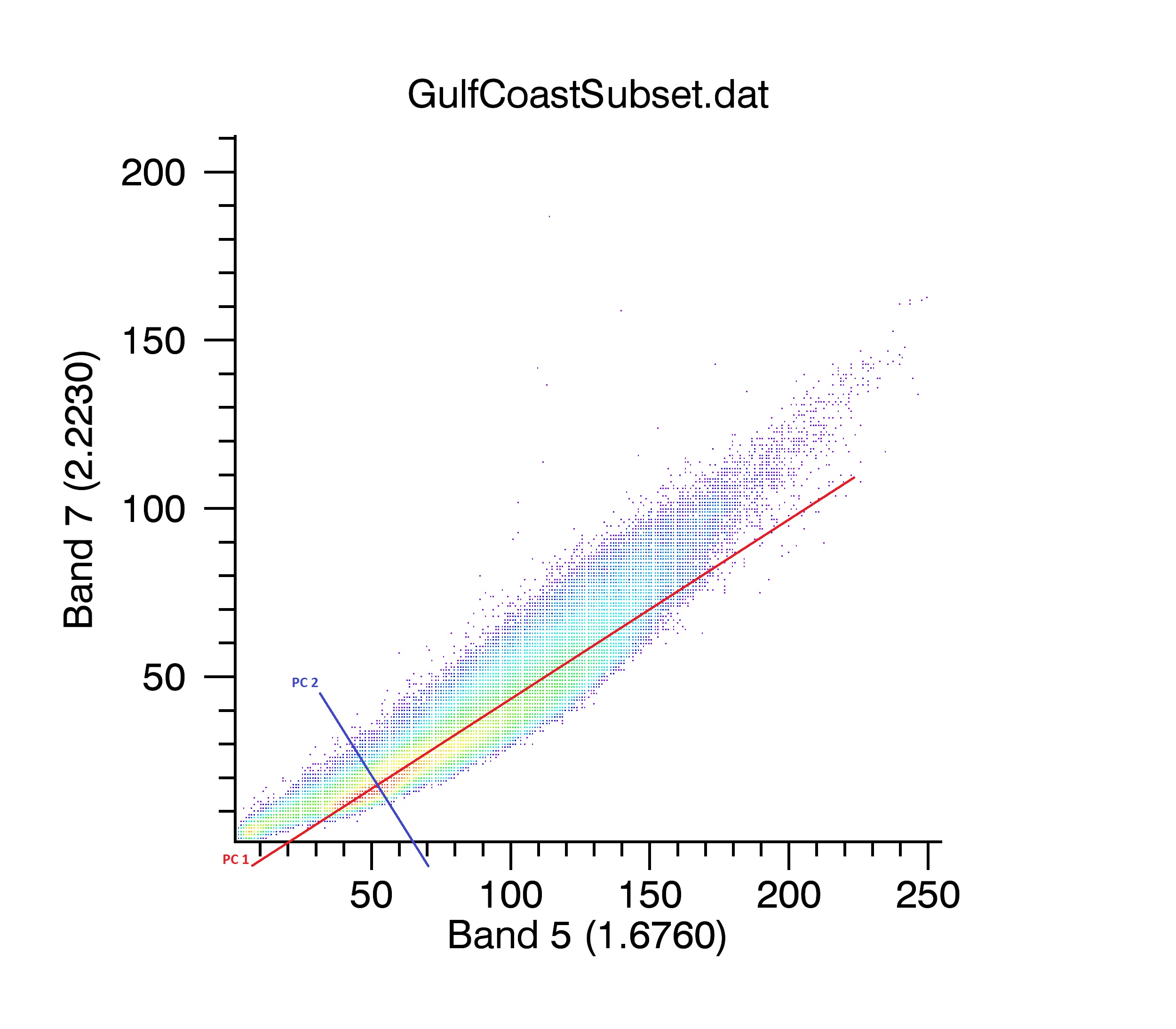
Taken a step further and plotting the brightness of each pixel in two bands, a scatterplot, is created:
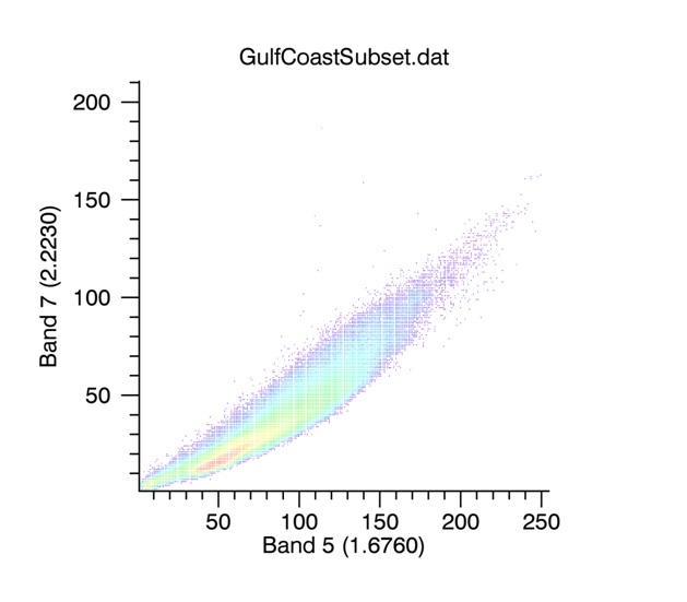
PCA looks at that scatter plot and says, “Why do we need two bands to describe each pixel, when we could use one number and get most of the information?” So, a new axis is drawn through the average and along the longest axis of the cloud of data points, then all the pixels are scored (shortest distance) on that new axis. That’s the First Principal Component. A second axis is drawn perpendicular to the first, also through the average, to capture remaining information. Roughly, it would look like this:
You always end up with as many Principal Components as bands you started with. While we can’t draw in 4 (or more) dimensions, creating those axes works the same. In the case of Landsat TM data we get 6 Principal Components.
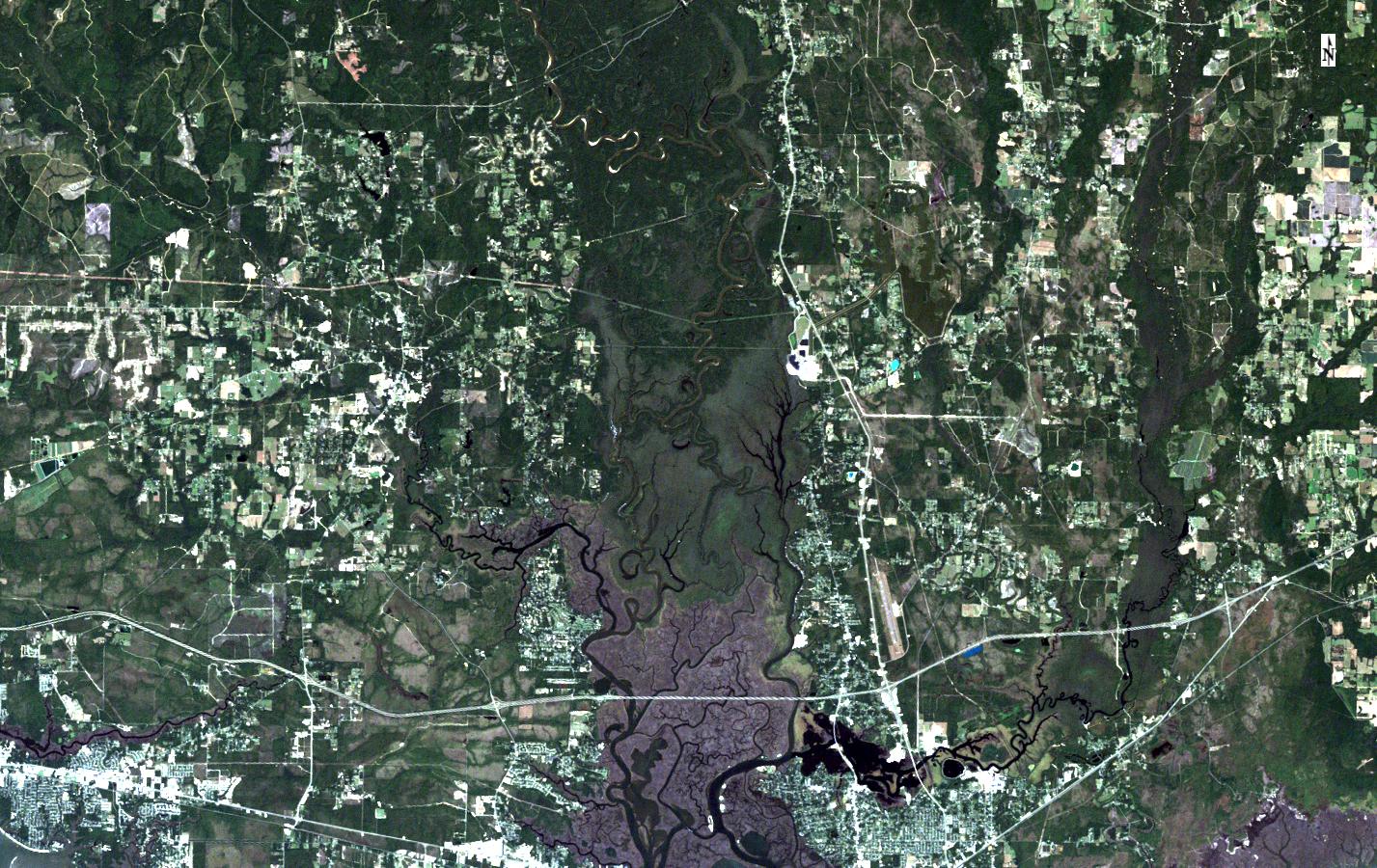
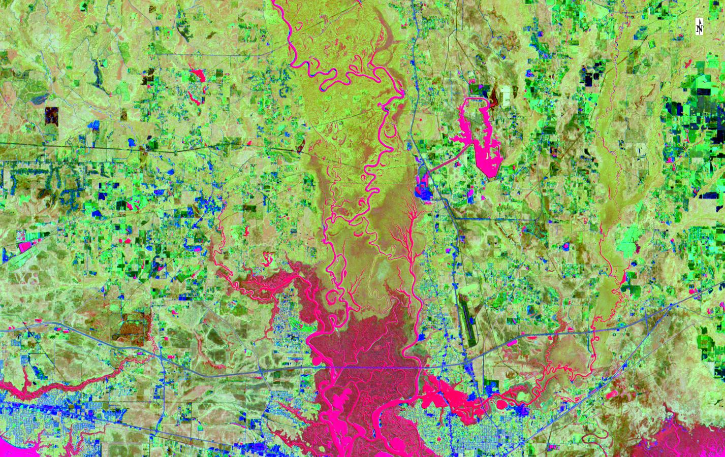
There are several very good reasons why you would go to all this effort. First, because PCA packs as much independent information as possible in to the components, the first ones have the most information. This means you can make an RGB display of the first three PCA bands and have an image containing the maximum amount of information you can put on the screen at one time. In the case of our Alabama Landsat scene, we go from a scene that has a lot of information but can be hard to interpret:
To a PCA composite that maximizes the amount of information and visual separation of what’s going on in the image. Here’s what we get when we put the first three PCA bands in to an RGB composite:
The image content shows up much more distinctly because PCA is packing as much signal as possible in to those three bands. You can see this with the Eigenvalue plot that gets generated when you run PCA:
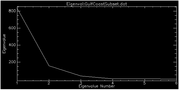
The short story on the plot is that high eigenvalues (y-axis) mean lots of information in the PCA band (x-axis). Here we’re really not getting much after about the third component. This brings up a second benefit of PCA: “reducing data dimensionality”. We can get almost all of the information from a 6 band image in just 3 well-crafted PCA bands. This reduces data processing, especially with hyperspectral data, taking you from hundreds of bands to tens of bands.
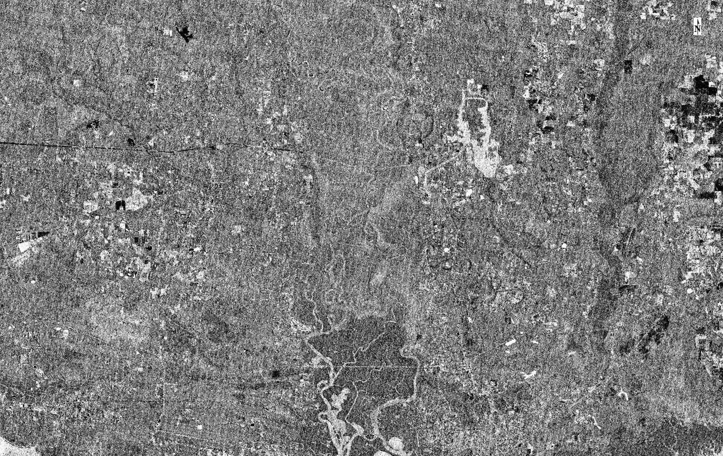
With most content in the first 3 bands, a third benefit of PCA appears, de-noising. Those later bands are mostly noise or faint signal indistinguishable from noise. Note that I did not say they are only noise. They are worth a look.Some interesting sensor artifacts reside in the 5th and 6thPCA bands from our Landsat scene. There is some signal, but a grid pattern appears in the otherwise noisy-looking image, artifacts of the sensor and processing:
PCA helps us get as much information as possible from our data and make it as easy to view as possible. With more advanced work, we could use it for noise filtering or diagnosing sensor problems. But we can build onPCA, which brings us to our second data transform.
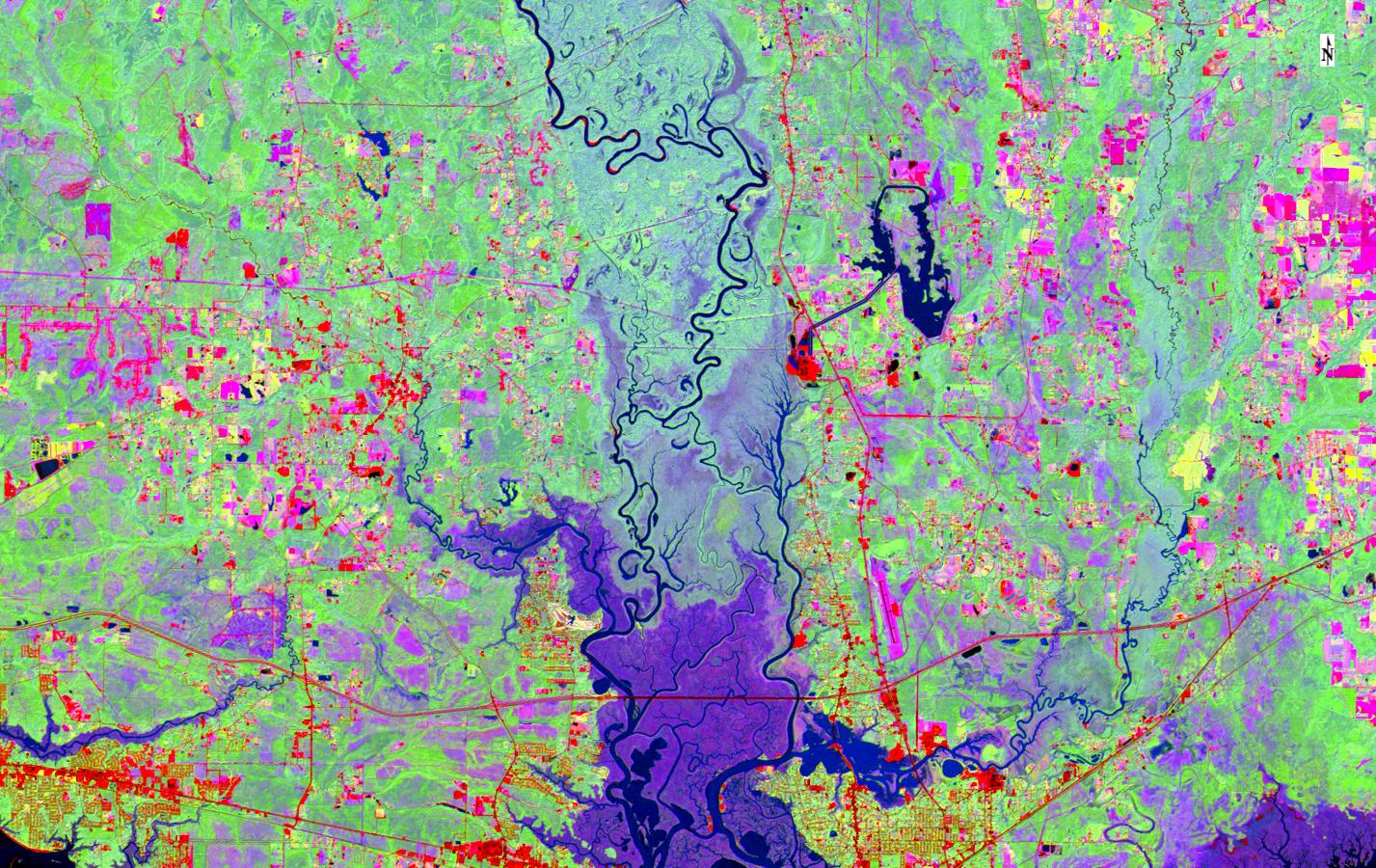
MNF, which is Minimum Noise Fraction or Maximum Noise Fraction in various publications, is two PCA transforms in a row. One of them is based on the data statistics, just like PCA, but the other one is based on noise statistics. Using the same idea of drawing our new component axes to maximize when and how we catch signal, but doing it with an eye towards the noise information, MNF does a better job of pushing signal to the first components and noise to the later ones. It is more work, but worth it for the same reasons PCA is a good idea. Here are the first 3 MNF components in an RGB composite:
MNF improves on PCA by doing two transforms and including information about noise. Independent Components Analysis (ICA) improves on it by examining that assumption about our normal distribution of data, all the way back in our first graph. We can see those curves aren’t ideal normal distributions. Perfect bell curves don’t usually happen. ICA accounts for that messiness, or clumping in the data. It looks at more advanced statistics than just the variance when it draws new axes. The results are great for filtering signal and noise. Same scene, first three ICA components:
Capturing and including some of that more subtle signal can make the image harder to interpret than the distinct colors of our MNF results,but it is often an improvement for further processing.
The next time you’re trying to pull information out of an image, give transforms a try. You can get more information on screen, clean up noise, reduce data volumes, and maximize results in further processing. Best of all, you don’t have to be an expert in math and stats to use transforms!