X

NV5 Geospatial Blog

Each month, NV5 Geospatial posts new blog content across a variety of categories. Browse our latest posts below to learn about important geospatial information or use the search bar to find a specific topic or author. Stay informed of the latest blog posts, events, and technologies by joining our email list!


Mapping Earthquake Deformation in Taiwan With ENVI

Mapping Earthquake Deformation in Taiwan With ENVI

12/15/2025

Unlocking Critical Insights With ENVI® Tools Taiwan sits at the junction of major tectonic plates and regularly experiences powerful earthquakes. Understanding how the ground moves during these events is essential for disaster preparedness, public safety, and building community resilience. But traditional approaches like field... Read More >

Comparing Amplitude and Coherence Time Series With ICEYE US GTR Data and ENVI SARscape

Comparing Amplitude and Coherence Time Series With ICEYE US GTR Data and ENVI SARscape

12/3/2025

Large commercial SAR satellite constellations have opened a new era for persistent Earth monitoring, giving analysts the ability to move beyond simple two-image comparisons into robust time series analysis. By acquiring SAR data with near-identical geometry every 24 hours, Ground Track Repeat (GTR) missions minimize geometric decorrelation,... Read More >

Empowering D&I Analysts to Maximize the Value of SAR

Empowering D&I Analysts to Maximize the Value of SAR

12/1/2025

Defense and intelligence (D&I) analysts rely on high-resolution imagery with frequent revisit times to effectively monitor operational areas. While optical imagery is valuable, it faces limitations from cloud cover, smoke, and in some cases, infrequent revisit times. These challenges can hinder timely and accurate data collection and... Read More >

Easily Share Workflows With the Analytics Repository

Easily Share Workflows With the Analytics Repository

10/27/2025

With the recent release of ENVI® 6.2 and the Analytics Repository, it’s now easier than ever to create and share image processing workflows across your organization. With that in mind, we wrote this blog to: Introduce the Analytics Repository Describe how you can use ENVI’s interactive workflows to... Read More >

Deploy, Share, Repeat: AI Meets the Analytics Repository

Deploy, Share, Repeat: AI Meets the Analytics Repository

10/13/2025

The upcoming release of ENVI® Deep Learning 4.0 makes it easier than ever to import, deploy, and share AI models, including industry-standard ONNX models, using the integrated Analytics Repository. Whether you're building deep learning models in PyTorch, TensorFlow, or using ENVI’s native model creation tools, ENVI... Read More >

1345678910Last
17785 Rate this article:
No rating

Gum Drop Plot

Anonym

On our IDL page, there is an image that displays a plot made out of a series of colorful spheres. Based on my research, this plot was generated a long time ago most likely using IDL Object Graphics.

I wanted to generate a similar plot using the IDL 8 Graphics Functions. To do this, I used the SCATTERPLOT3D routine, the ORB object (provided with the IDL distribution but not documented), and the POLYLINE routine.  An example of the output is shown below:


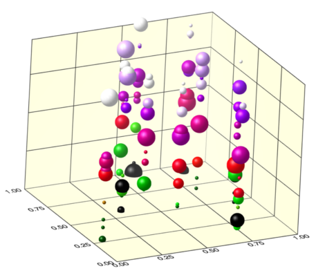
The data used to produce this plot is randomly generated. Therefore, if you run the code, the output will look different each time. The code used to generate this plot is shown below:

pro gum_drop

  compile_opt idl2
 
  ;Generate some random data to
  ;plot
  x = RANDOMU(seed, 10)
  y = RANDOMU(seed, 10)
  z = RANDOMU(seed, 10)
 
  ;Draw an initail scatter
  ;plot with symbolsize of 1    
  scat_plot = scatterplot3d(x,y,z,RGB_TABLE=2, $
              SYM_OBJECT=orb(),$ ;use an orb object as symbol
              SYM_SIZE=1, $ ;Set symbol size to 1
              MAGNITUDE=z, $ ;change color with Z value
              /SYM_FILLED, clip=0,$ ;Fill symbols and no clipping
              xticklen=0, yticklen=0, zticklen=0, $ ;remove ticks
              xsubticklen=0, ysubticklen=0, zsubticklen=0, $ ;remove ticks
              xmajor=5, ymajor=5, $ ;Only use 5 ticks on each axis
              xrange=[0,1], yrange=[0,1],$ ;force the x and y range
              ASPECT_RATIO=1.0,$  ;Don't distort the image
              DEPTH_CUE=[0,4], $ ;Make things farther away fade
              AXIS_STYLE=2, $  ;Make the axis a box
              background_color = 'light yellow')
 
 
  ;Draw 9 more plots where the symbol size
  ;changes each plot
  for ind = 2L, 10 do begin
   z = RANDOMU(seed, 10)
   scat_plot_loop = scatterplot3d(x,y,z,$
      RGB_TABLE=2, SYM_OBJECT=orb(),SYM_SIZE=ind/2, $
      MAGNITUDE=z, /SYM_FILLED, clip=0, /OVERPLOT)
  endfor

  ;Generate polygons to create a grid
  ;on the Z-Y and Z-X planes
  x = [0.25,0.25,0.5,0.5,0.75,0.75]
  y = [0.999,0.999,0.999,0.999,0.999,0.999]
  z = [0.00,1.00,0.0,1.0,0.00,1.00]

  ;Connect every 2 points in polygon data
  ;with lines using the CONNECTIVITY keyword

  con = [2,0,1,2,2,3,2,4,5]

  poly0 = polyline(x,y,z,/DATA,CONNECTIVITY=con)
 
  temp = x
  x=y
  y=temp
 
  poly1 = polyline(x,y,z,/DATA,CONNECTIVITY=con)
 
  temp = z
  z = y
  y = temp
 
  poly2 = polyline(x,y,z,/DATA,CONNECTIVITY=con)
 
  temp = x
  x=y
  y=temp
 
  poly3 = polyline(x,y,z,/DATA,CONNECTIVITY=con)
 
  ;Remove the axis from the front of
  ;the plot
  ax = scat_plot.AXES
  ax[2].hide=1
  ax[6].hide=1
  ax[7].hide=1
  ax[3].ticklen=1.0
  ax[1].ticklen=1.0
 
end

Please login or register to post comments.