Applying Color Thresholds for Better Visualization Granularity
Anonym
If you look it up, experts disagree about exactly how many different colors the human eye can see. But most agree that we can differentiate more than several million different colors. Similar to color, our eyes our also great at interpreting spatial resolution. Think of the pointillist technique in painting where single dots of color are placed on canvas and up close you see dots, but back away several steps and the colors blend together in what are sometimes very vivid paintings.
Today I thought I'd share an example of combining a product from a high spatial resolution satellite image with what I'll call a "smart"color table to tease out some granularity from the derived product that is very easy to see.
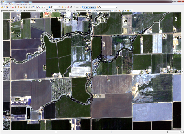
Original Astrium image courtesy of Airbus Defense and Space
In this example, I am using an Astrium image courtesy of Airbus Defense and Space. I have pre-processed the image to ground reflectance and derived an NDVI image. With this image, the goal is to find the fields that are ready for harvest.
This use-case is theoretical where I am assuming that some crops in this image are probably wheat, corn, or something else, but there is some variety to what is planted. I am going to focus only on the crops that have an NDVI value of .91 when they are ready to harvest* (see note).
After my original analysis, I have a single-band gray scale NDVI image. I can see that some of the brighter areas are probably healthier fields, but it is not easy to derive context when the image is displayed in this way:
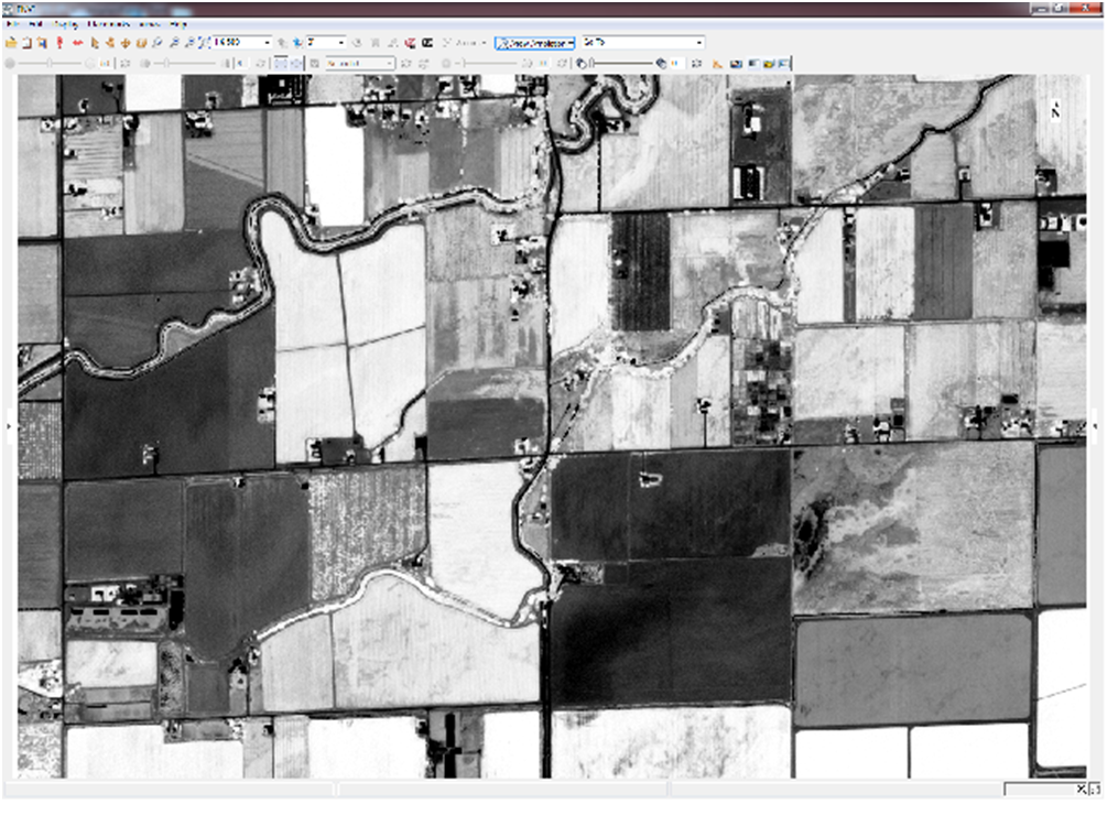
NDVI image after pre-processing original data to ground reflectance
One thing I can do is apply a color table to the image. I do this by taking all the values represented in the image (range is -1 to 1 for an NDVI image) and making equal size histogram bins. Each bin represents a data range, and looks something like this where the black curve represents the number of pixels in the scene having a particular value:
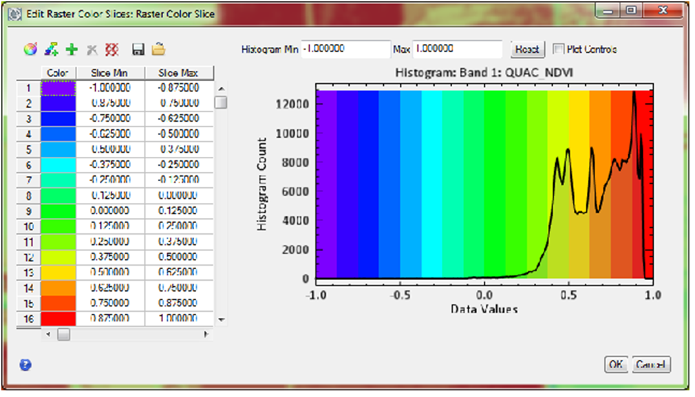
Raster color slice tool in ENVI. Blackplot represents NDVI image data histogram, colors represent each bin. Color range includes all data values from -1 to 1.
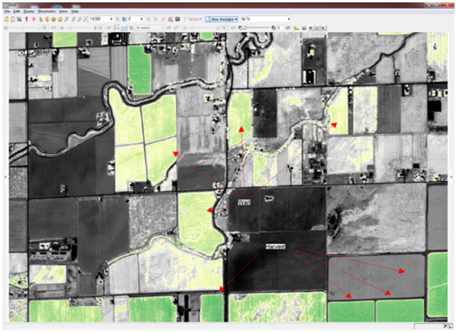
The result is an image where I can guess that the fields of interest are pretty close to harvest because they are red -which represents the top values in my data (remember the value we're looking for is .91).
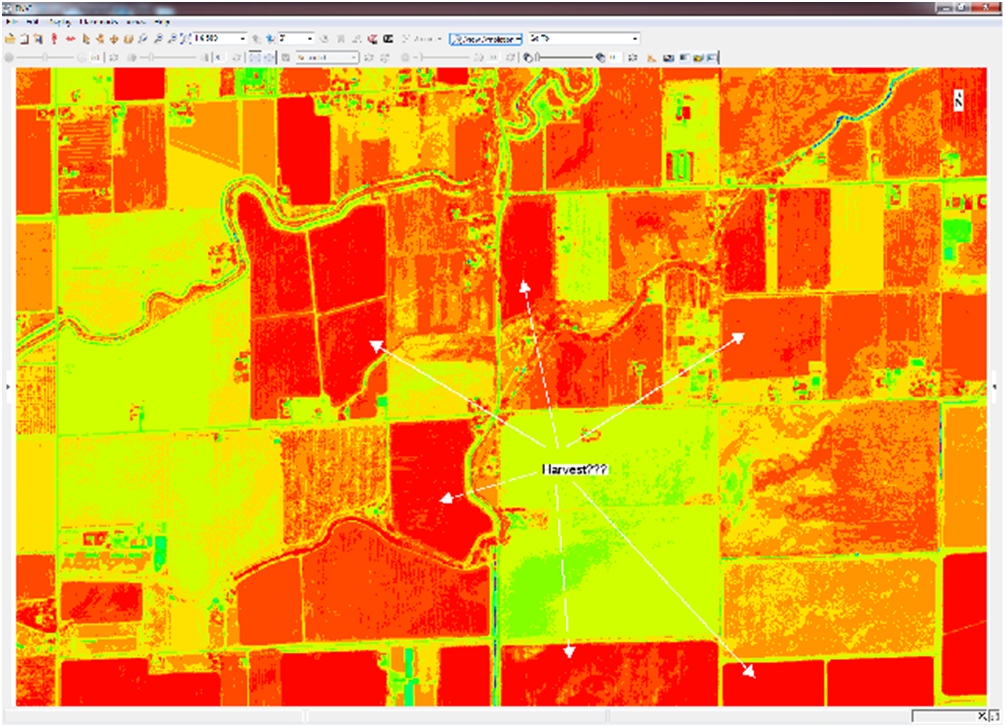
NDVI image with rainbow color table applied to data values from -1 to 1.
However, information that is not applicable to my analysis is included in my product. This is not ideal because the bottom of my color table includes impervious surfaces and very dry material. Therefore, instead of seeing granularity within my fields, they are mostly all classified as"vegetation". For my analysis to make more sense, I can apply a "smart" color table to the NDVI image and set my threshold to only the data values I care about. I can also apply a color table that makes more sense for my analysis that will make healthy vegetation pixels appear darker green than other vegetation pixels. Now my bins look like this:
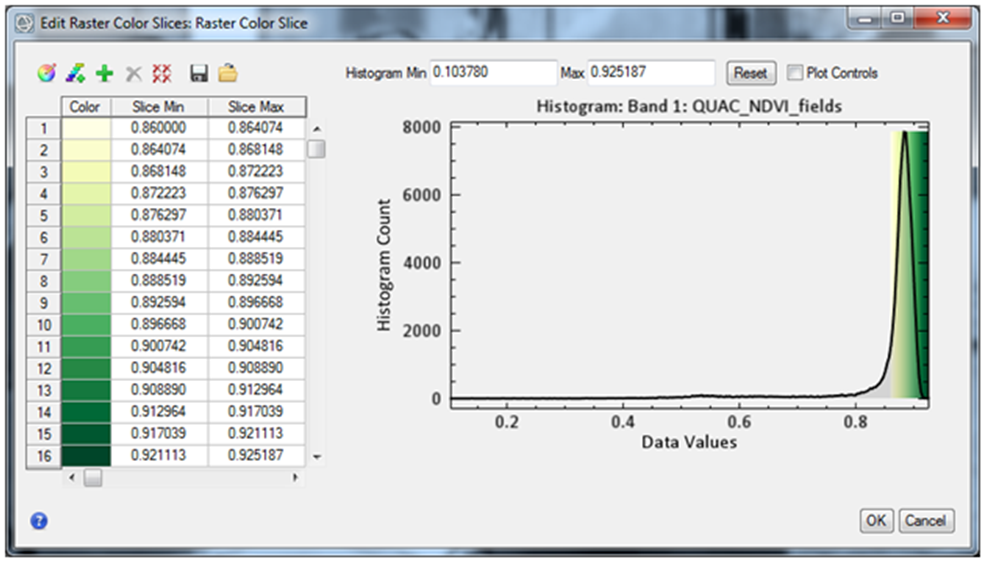
Color range is from .86 to .92 where darkest greens represent pixels closest to the optimal value for this analysis which is .91.
I have the same number of colors, but I am adding granularity to my analysis by applying all those colors to a much smaller range ofdata. The result tells a different story than my original analysis. Some of the fields I thought were ready to harvest may need a bit more time, whereas other field do in fact look ready to harvest.
NDVI image with yellow-green color table applied to data ranges .86 to .92.
In summary, combining high spatial resolution, trusted indices, and "smart" color thresholds provides a means to derive improved analysis products that are easy to interpret and thus easier to plan against.
*Note: The best NDVI value for harvesting a particular crop is specific to each crop and unique individual field. This value is also subjective to an extent and is normally determined in combination with other vegetation indices and almost always with ground measurements. The values used in this example are not intended for production.