Time Aware Analysis - More than a Visualization
Anonym
I've been running into some exciting opportunities lately to look at time-enabled data sets and consider some of the ways to shift the paradigm of thinking. In the older paradigm we have always looked at a snapshot of an area at a specific time and performed some sort of analysis to extract meaningful information. With time-aware data we start to look at animated views of how an area changes over a given range of time. We even go so far as to measure how things change over time and to what extent. These are useful ways to include a temporal component to some analyses.
However, recently I have been considering this question: What additional information can we extract by looking at a snapshot OF time. In other words, what effects has time had from an analytic perspective over a given area of interest? Take for example some of the images below. First, let's look at some global temperature heat maps overtime. We can animate these images and watch the temperatures change over time.
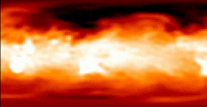
While the animation is interesting, we can also look at these global temperatures as a single image, or perform an analysis of how different each time snapshot is from the average? Example data shipped with ENVI.

Figure 1: Global air temperature over time. upper left: average over three different times, upper right: average - time 1, lower left: average - time 2, lower right: average - time 3.
By computing an average at each pixel over three times, not only can we view an average global temperature map for that time span, but we can also compute and visualize departures from average for each image. This can enable us to see trends and variations in our data.
Let’s look at this concept from an agricultural analysis perspective using these images over a rural area in California. These images represent the same geographical extent at three different times during the growing season. These are NDVI images with a yellow-green color table applied where the darkest greens represent the healthiest vegetation. Data courtesy of Airbus.

Figure 2: NDVI image time 1

Figure 3: NDVI image time 2

Figure 4: NDVI image time 3
The yellow areas are stressed. In image 1, we might draw conclusions about which fields need attention and which are doing well. In image 2 we might draw the same or similar conclusion. But as the summer gets warmer and we look at image 3, fields that we thought were thriving now look like they are undergoing stress.
While it is important to understand which fields might need more attention at various times throughout the season, it is also useful to look at a snapshot of health over time. The image below represents the average NDVI of the area of interest over the three different times.

Figure 5: Average NDVI image times 1, 2, and 3
Here we can see how stress over a particularly short time can affect fields that were otherwise thriving. How might this affect yield? Costs? Planning?
What are some of the ways you are planning to combine spectral indices or other analyses of time-aware data to generate richer information products?