Visualizing Sparse Environmental Monitoring Data in 3D
The role of visualization in data analysis is to augment our ability to sense relationships in a more intuitive way.
Sparse, spatially irregular data can be a challenge for us to associate into a visually coherent pattern.
Imagine a pond where samples of some quantity such as methane gas or algal concentration are collected in the field at different depths and at different locations, a problem we tackled in our NV5 Geospatial Custom Solutions Group a few years ago.
We would like to build a tool to visualize these concentrations in various 3-dimensional forms, such as planar slices interpolated to the side of the pond, something like this.
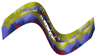
This blog highlights a couple techniques that can be used to project irregular data into planes and other more complex surfaces like the one shown above.
An image is one form of data where we generally have a regular grid of pixels in two dimensions. This makes visualization straightforward. ENVI is good at this.
When we add a third spatial dimension and irregular sampling the visualization becomes significantly more challenging. We really need IDL to effectively visualize complex types of data like this, rather than ENVI.
Before proceeding, I am compelled to point out that what I present below is at best a first-pass estimator using a very general model for interpolating data between sampling points. An appropriate physical model of the system would produce a more realistic final display, of course. The focus of this blog is on the visualization techniques and not the modeling.
For this demonstration, we'll need to simulate some data. We'll generate an outline for our "pond" and randomly seed it with sampling points having simulated experimental values.
The complete example can be found in the downloadable routine ribbonimage.pro.
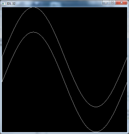
The first step is to generate a polygon representing the pond. To make it more of a challenge, let's make the pond a complex shape, a pair of sine curves offset from one another.
A = Findgen(361)
Theta = A*!dtor
Y1 = Sin(Theta)
Y2 = Y1 + .5
X = A/180.
XX = [X, X[360], Reverse(X), X[0]]
YY = [Y1, Y2[0], Reverse(Y2), Y1[0]]
The X and Y coordinates are in "data space". We will use these coordinates in a couple different ways. Later on we will use the coordinates to build "walls" for the pond. First, we will show the outline of the pond. I like to use Direct Graphics for simple displays like this.
ImageSize = 512
Window, /Free, XSize = ImageSize, YSize = ImageSize
Plot, XX, YY, YRange = [Min(YY), Max(YY)], XStyle = 5, $
    YStyle = 5, XMargin = [0, 0], YMargin = [0, 0]
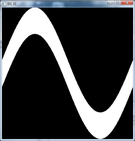
Next fill in the pixels of the pond and return the coordinates of the filled pixels. The coordinates of the mask will be in pixels rather than data space.
PolyFill, XX, YY
Im = TVRD()
Mask = Array_Indices(Im, Where(Im))
MaskX = Mask[0, *]
MaskY = Mask[1, *]
Of all the filled pixels, randomly select 250 of them as our sampling points.
NPoints = 250
NMask = N_elements(Mask)
Points = RandomU(Seed, NPoints) * NMask
PointsX = MaskX[Points]
PointsY = MaskY[Points]
Convert the sampling point locations to data coordinates, and create random Z positions for the data in the pond.
XY = Convert_Coord(PointsX, PointsY, /Device, /To_Data)
PointsX = Reform(XY[0, *])
PointsY = Reform(XY[1, *])
ZMin = -.3
ZMax = 0.
PointsZ = ZMin + RandomU(Seed, NPoints)*(ZMax - ZMin)
Scale the random Z positions to the range 0 to 255. In this example, each sample's "value" is simply the sampling location's depth, scaled to this range.
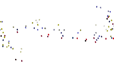
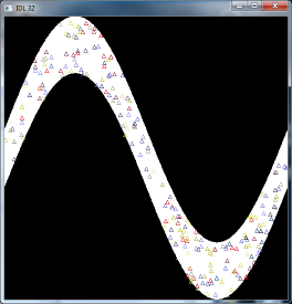
Plot the sampling points, projected into the 2-dimensional space, showing their distribution.
TVLCT, R, G, B, /Get
LoadCT, 15, /Silent
TVLCT, Red, Green, Blue, /Get
Device, Get_Decomposed = WasDecomposed
Device, Decomposed = 0
For I = 0L, N_elements(PointsX) - 1 Do Begin
    PlotS, PointsX[I], PointsY[I], Color = Values[I], PSym = 5
EndFor
Device, Decomposed = WasDecomposed
TVLCT, R, G, B
Here, the colors of the symbols represent the depth values.
Next, we will switch to Object Graphics to do the heavy lifting in the third dimension. Create an IDLgrModel to hold the graphics and a color palette we will apply to our sampling points and pond "walls".
oM = IDLgrModel()
oPalette = IDLgrPalette()
oPalette.LoadCT, 15
Create the coordinates for a generic "sampling cylinder".
CylRadius = .01
CylHeight = .02
XCyl = Cos(Theta)*CylRadius
YCyl = Sin(Theta)*CylRadius
Mesh_Obj, 5, CylV, CylConn, $
    Transpose([[XCyl], [YCyl], [Replicate(-CylHeight/2, 361)]]), $
    P1 = 4, P2 = [0, 0, CylHeight], /Close
Create a cylinder object at the location of each of the random sampling points, colored according to its depth.
For I = 0, NPoints - 1 Do Begin
    oM2 = IDLgrModel()
    oM.Add, oM2
    oCyl = IDLgrPolygon( $
       CylV, $
       Poly = CylConn, $
       Color = Values[I], Palette = oPalette)
    oM2.Add, oCyl
    oM2.Translate, PointsX[I], PointsY[I], PointsZ[I]
EndFor
The sampling points can by rendered by themselves. You can use a tool such as XOBJVIEW to render the main container model, the variable "oM".
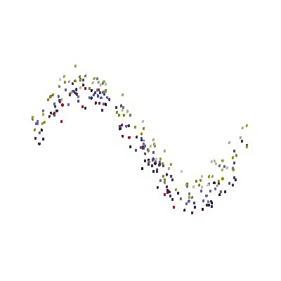
You can see a chief problem we encounter when displaying sparse data like this. Yes, we can discern the individual points but the negative space between points makes it difficult for us to see the patterns in the data, even with the advantage of animation.
We can create a model of a grid of connected points in space between or around our data points. There is no requirement that the space must be rectilinear. We can calculate the data interpolated (preferably using a physical model) at each of the grid points. Then we allow the graphics system to perform the additional interpolation at the scale of the distance between our grid points.
To create the grid for this example, use MESH_OBJ to extrude the pond outline up along the Z axis. The more steps we add, and the more points along the outline, the smoother the display will be.
NZSteps = 50
Mesh_Obj, 5, V1, P1, Transpose([[XX], [YY], [Replicate(ZMin, 361*2+2)]]), $
     P1 = NZSteps, P2 = [0, 0, (ZMax - ZMin)]
Create a new IDLgrPolygon with the vertex coordinates generated by MESH_OBJ.
NVertices = N_elements(V1)/3
oP1 = IDLgrPolygon(V1, Poly = P1)
oM.Add, oP1
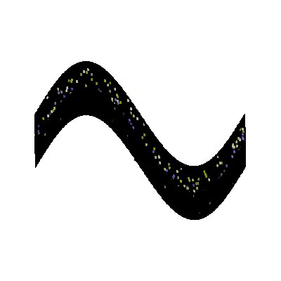
By setting the STYLE property on the pond wall's IDLgrPolygon temporarily to 1, we can see the mesh that was generated. The intersecting coordinates of the mesh will be precisely where we will want to interpolate the "measured" values.
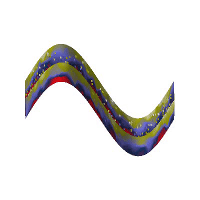
For each of the vertices in the pond wall, calculate its interpolated value based on its distance from the nearest (N = 3) sampling points, and perform one type of inverse distance weighting so the closest sampling location has a larger influence than the others. The color of the vertex at that location is calculated from the weighted average. This is where you would insert your own physical model.
N = 3
VertexColors = BytArr(NVertices)
For I = 0L, NVertices - 1 Do Begin
  Delta = Sqrt((V1[0, I] - PointsX)^2 + $
    (V1[1, I] - PointsY)^2 + (V1[2, I] - PointsZ)^2)
  S = Sort(Delta)
  DeltaS = Delta[S[0:N - 1]]
  XNear = PointsX[S[0:N - 1]]
  YNear = PointsY[S[0:N - 1]]
  ZNear = PointsZ[S[0:N - 1]]
  VNear = Values[S[0:N - 1]]
  Sum = Total(1.0/DeltaS^2)
  W = (1./DeltaS^2)/Sum
  VertexColors[I] = (Total(VNear*W) > 0) < 255B
EndFor
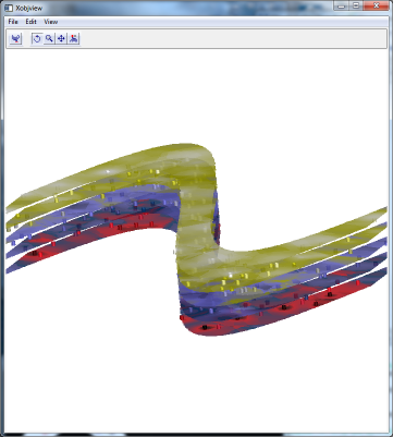
Assign the vertex colors we have calculated to the pond wall polygon, then render the graphics model.
oP1.SetProperty, Vert_Colors = VertexColors, Palette = oPalette, $
   Style = 2
oM.Rotate, [1, 0, 0], -60
XObjView, oM
This solution can be generalized to any sort of sampling surface, For example, we might instead look at horizontal slices, with some transparency thrown in for additional interest.
Or we may even show an oblique slicing plane through the data.
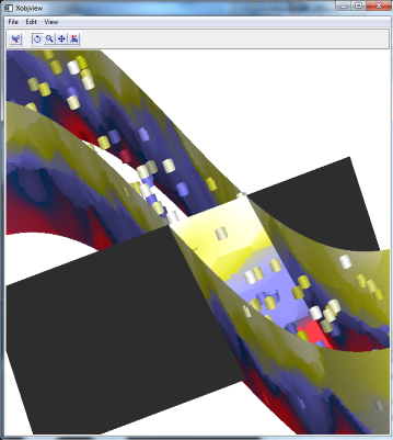
These are exercises for the reader.