Tab widgets create a “tabbed” interface that allows the user to select one of a list of rectangular display areas to be displayed in a single space (the tab set). The displayed interface elements are contained in base widgets. That is, selecting a tab displays the contents of a specified base widget within the tabbed interface. See WIDGET_TAB for a complete description of the function used to create tab widgets.
This section discusses the following topics:
Example: A Simple Tab Widget
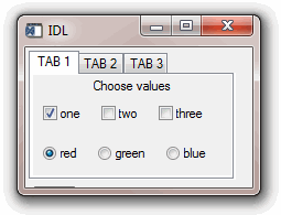
The following procedures build a simple tabbed interface with three tabs containing a variety of other widgets.
This example is included in the file tab_widget_example1.pro in the examples/doc/widgets subdirectory of the IDL distribution. Run this example procedure by entering tab_widget_example1 at the IDL command prompt or view the file in an IDL Editor window by entering .EDIT tab_widget_example1.pro. See Running the Example Code if IDL does not run the program as expected.
PRO tab_widget_example1_event, ev
WIDGET_CONTROL, ev.TOP, GET_UVALUE=stash
IF (ev.ID EQ stash.bDone) THEN WIDGET_CONTROL, ev.TOP, /DESTROY
END
PRO tab_widget_example1, LOCATION=location
wTLB = WIDGET_BASE(/COLUMN, /BASE_ALIGN_TOP)
wTab = WIDGET_TAB(wTLB, LOCATION=location)
wT1 = WIDGET_BASE(wTab, TITLE='TAB 1', /COLUMN)
wLabel = WIDGET_LABEL(wT1, VALUE='Choose values')
wBgroup1 = CW_BGROUP(wT1, ['one', 'two', 'three'], $
/ROW, /NONEXCLUSIVE, /RETURN_NAME)
wBgroup2 = CW_BGROUP(wT1, ['red', 'green', 'blue'], $
/ROW, /EXCLUSIVE, /RETURN_NAME)
wT2 = WIDGET_BASE(wTab, TITLE='TAB 2', /COLUMN)
wLabel = WIDGET_LABEL(wT2, VALUE='Move the Slider')
wSlider = WIDGET_SLIDER(wT2)
wT3 = WIDGET_BASE(wTab, TITLE='TAB 3', /COLUMN)
wLabel = WIDGET_LABEL(wT3, VALUE='Enter some text')
wText= WIDGET_TEXT(wT3, /EDITABLE, /ALL_EVENTS)
wControl = WIDGET_BASE(wTLB, /ROW)
bDone = WIDGET_BUTTON(wControl, VALUE='Done')
stash = { bDone:bDone }
WIDGET_CONTROL, wTLB, /REALIZE
WIDGET_CONTROL, wTLB, SET_UVALUE=stash
XMANAGER, 'tab_widget_example1', wTLB, /NO_BLOCK
END
Calling tab_widget_example1 with the LOCATION keyword set to an integer value between 0 and 4 displays the same interface with the tabs placed on different sides.
As with many of the examples in this section, this one is designed to merely exhibit the features of the tab widget. Most of the useful things you might do with a tab widget take place in the event handling routines for the individual widgets displayed on each tab; see Example: Retrieving Values for a more complicated example that stores the values of the individual widgets for later use.
Tab Sizing and Multiline Behavior
The size of the rectangular area of the tab display (where individual widgets are placed) is determined by the size of the largest base widget included in the tab set. The size of the “tab” itself (the curved area that sticks out from the rectangular base and contains the tab’s title) is determined by a number of factors, including the size of other tabs, the presence of the LOCATION and MULTILINE keywords, and the platform on which the widget application is running.
IDL attempts to create a tab that is large enough to contain the tab’s title (which is set via the TITLE keyword to WIDGET_BASE for the base widget that has the tab widget as its parent). This, coupled with the fact that the value of the MULTILINE keyword has different meanings on different platforms (see WIDGET_TABfor details), leads to the following behaviors:
Windows Behavior
Tabs are created to show the entire text of the TITLE keyword to WIDGET_BASE.
If LOCATION = 0 or 1
Setting the LOCATION keyword to WIDGET_TAB equal to zero places the tabs on the top of the tab set; setting LOCATION to one places the tabs on the bottom of the tab set. In either case, if the MULTILINE keyword is set equal to zero, and the width of the tabs exceeds the width of the largest child base widget, the tabs are shown with scroll buttons. This allows the user to scroll through the tabs while the base widget stays immobile.
If the MULTILINE keyword is set to a positive value, the tabs will be placed in as many rows as are necessary in order to display the entire text of each tab (limited by the width of the largest base, see note below).
If LOCATION = 2 or 3
Setting the LOCATION keyword to WIDGET_TAB equal to two places the tabs on the left edge of the tab set; setting LOCATION equal to three places the tabs on the right edge of the tab set. In either case, a multiline display is always used if the width of the tabs exceeds the height of the largest child base widget, even if the MULTILINE keyword is set equal to zero. Tabs are placed in as many rows as are necessary in order to display the entire text of each tab (limited by the height of the largest base, see note below).
Note: The width or height of the tab widget is based on the width or height of the largest base widget that is a child of the tab widget. If the width of the text of one tab exceeds the width or height of the tab widget, the text will be truncated even if the MULTILINE keyword is set.
Motif Behavior
Motif platforms interpret the value of the MULTILINE keyword to be the maximum number of tabs to display per row. If the keyword is not specified or is explicitly set equal to zero, all tabs are placed on the same row. Tabs are created to show the entire text of the TITLE keyword to WIDGET_BASE. The text of the tabs is not truncated in order to make the tabs fit the space available, unless the text of a single tab exceeds the width or height of the largest base widget that is a child of the tab widget. This means that if the MULTILINE keyword is set to any value other than one, some tabs may not be displayed.
Tips for Tab Layout
There is no good way to determine in advance the best setting for the MULTILINE keyword to ensure an appropriate tab display. In most cases, however, the following suggestions should enable you to create a tab display that is useful on both Windows and UNIX platforms.
- Keep tab titles short. If you need a long description of the contents of a tab, use a label widget in the tab’s base widget rather than creating a long title.
- Set the MULTILINE keyword equal to a value greater than one. This allows you to tune the appearance of your tab set to the Motif platform without changing the appearance under Windows, since any value greater than zero will result in a multiline tab display under Windows.
- If practical, place the tabs along the longest dimension of the tab widget, as determined by the size of the largest base widget.
Example: Retrieving Values
The following example builds on Example: A Simple Tab Widget by adding the following features:
- “Next” and “Previous” buttons that switch the tab display to the next (or previous) tab in the tab set.
- A mechanism for saving the values of the widgets in the tab interface. Implementing such a mechanism allows the user to view and change all of the settings accessible via the tab widget before committing any of them.
- A mechanism for canceling. It exits from the tabbed interface without committing any changes made via the tab interface.
This example is included in the file tab_widget_example2.pro in the examples/doc/widgets subdirectory of the IDL distribution. Run this example procedure by entering tab_widget_example2 at the IDL command prompt or view the file in an IDL Editor window by entering .EDIT tab_widget_example2.pro. See Running the Example Code if IDL does not run the program as expected.
PRO tab_widget_example2_event, ev
WIDGET_CONTROL, ev.TOP, GET_UVALUE=stash
numTabs = WIDGET_INFO(stash.TopTab, /TAB_NUMBER)
thisTab = WIDGET_INFO(stash.TopTab, /TAB_CURRENT)
IF (thisTab EQ 0) THEN BEGIN
WIDGET_CONTROL, stash.bPrev, SENSITIVE=0
ENDIF ELSE BEGIN
WIDGET_CONTROL, stash.bPrev, SENSITIVE=1
ENDELSE
IF (thisTab EQ numTabs - 1) THEN BEGIN
WIDGET_CONTROL, stash.bNext, SENSITIVE=0
ENDIF ELSE BEGIN
WIDGET_CONTROL, stash.bNext, SENSITIVE=1
ENDELSE
IF (ev.ID EQ stash.bNext) THEN $
TWE2_SwitchTab, thisTab, numTabs, stash, /NEXT
IF (ev.ID EQ stash.bPrev) THEN $
TWE2_SwitchTab, thisTab, numTabs, stash, /PREV
IF (ev.ID EQ stash.bDone) THEN BEGIN
PRINT, 'BGroup1 selected indices: ', stash.retStruct.BGROUP1
PRINT, 'BGroup2 selected index: ', stash.retStruct.BGROUP2
PRINT, 'Slider value: ', stash.retStruct.SLIDER
PRINT, 'Text value: ', stash.retStruct.TEXT
WIDGET_CONTROL, ev.TOP, /DESTROY
ENDIF
IF (ev.ID EQ stash.bCancel) THEN BEGIN
PRINT, 'Update Cancelled'
WIDGET_CONTROL, ev.TOP, /DESTROY
ENDIF
END
FUNCTION TWE2_saveValue, ev
WIDGET_CONTROL, ev.TOP, GET_UVALUE=stash
WIDGET_CONTROL, ev.ID, GET_VALUE=val, GET_UVALUE=uval
stash.retStruct.(uval) = val
WIDGET_CONTROL, ev.TOP, SET_UVALUE=stash
END
PRO TWE2_SwitchTab, thisTab, numTabs, stash, NEXT=NEXT, PREV=PREV
IF KEYWORD_SET(NEXT) THEN nextTab = (thisTab + 1) MOD numTabs
IF KEYWORD_SET(PREV) THEN BEGIN
IF (thisTab EQ 0) THEN BEGIN
nextTab = numTabs - 1
ENDIF ELSE BEGIN
nextTab = (thisTab - 1)
ENDELSE
ENDIF
WIDGET_CONTROL, stash.TopTab, SET_TAB_CURRENT=nextTab
END
PRO tab_widget_example2, LOCATION=location
wTLB = WIDGET_BASE(/COLUMN, /BASE_ALIGN_TOP)
wTab = WIDGET_TAB(wTLB, LOCATION=location)
wT1 = WIDGET_BASE(wTab, TITLE='TAB 1', /COLUMN)
wLabel = WIDGET_LABEL(wT1, VALUE='Choose values')
wBgroup1 = CW_BGROUP(wT1, ['one', 'two', 'three'], $
/ROW, /NONEXCLUSIVE, /RETURN_NAME, UVALUE=0, $
EVENT_FUNC='TWE2_saveValue')
wBgroup2 = CW_BGROUP(wT1, ['red', 'green', 'blue'], $
/ROW, /EXCLUSIVE, /RETURN_NAME, UVALUE=1, $
EVENT_FUNC='TWE2_saveValue')
wT2 = WIDGET_BASE(wTab, TITLE='TAB 2', /COLUMN)
wLabel = WIDGET_LABEL(wT2, VALUE='Move the Slider')
wSlider = WIDGET_SLIDER(wT2, UVALUE=2, $
EVENT_FUNC='TWE2_saveValue')
wT3 = WIDGET_BASE(wTab, TITLE='TAB 3', /COLUMN)
wLabel = WIDGET_LABEL(wT3, VALUE='Enter some text')
wText= WIDGET_TEXT(wT3, /EDITABLE, /ALL_EVENTS, UVALUE=3, $
EVENT_FUNC='TWE2_saveValue')
wControl = WIDGET_BASE(wTLB, /ROW)
bPrev = WIDGET_BUTTON(wControl, VALUE='<< Prev', SENSITIVE=0)
bNext = WIDGET_BUTTON(wControl, VALUE='Next >>')
bDone = WIDGET_BUTTON(wControl, VALUE='Done')
bCancel = WIDGET_BUTTON(wControl, VALUE='Cancel')
retStruct={ BGROUP1:[0,0,0], BGROUP2:0, SLIDER:0L, TEXT:'empty'}
stash = { bDone:bDone, bCancel:bCancel, bNext:bNext, $
bPrev:bPrev, TopTab:wTab, retStruct:retStruct}
WIDGET_CONTROL, wTLB, /REALIZE
WIDGET_CONTROL, wTLB, SET_UVALUE=stash
XMANAGER, 'tab_widget_example2', wTLB, /NO_BLOCK
END
The following things about this example are worth noting:
- The retStruct structure is an example of the kind of information you might pass out of a tab widget, back to a larger widget application. Using an approach like the one here allows the user to set a group of values before sending any of them to the larger application. This may be more efficient than updating the larger application “on the fly” as the user makes changes to the widgets in the tab interface.
- Similarly, if the user’s changes are not sent to the larger application until he or she clicks the “Done” button, it is important to provide a way for the user to cancel the operation entirely, without sending any changes.
- In most cases, when we refer to a field in a structure, we refer to it by its name. The event function TWE2_saveValue refers to the fields of the retStruct structure by their indices instead. We do this because while it is not possible to pass the field name in a variable, it is possible to pass the integer index value. Passing the index value of the appropriate field in the retStruct structure as the user value of the widget whose value is being saved allows us to write a single TWE2_saveValue function, rather than one function for each field in the retStruct structure.
- The “Next” and “Previous” buttons in this example imply that there is an order to the actions performed using the tab set. While there is no order in this example, it is easy to imagine a situation in which values from one tab would influence actions taken on another. You could even require that some action be taken on a given tab before a later tab could be displayed.