Once you have built a gridded time series, you can perform temporal processing to exploit changes that occur in measurements over time. This can be a pre-processing step for example categorization and removal of noise. Or, it can be a final step in image processing that returns features of interest.
This topic provides IDL code examples for processing time-series data. These are hypothetical examples that do not rely on specific data files. You will need to provide your own data for these examples.
See the following sections:
Time-Frequency Analysis
Time-Variable Plot
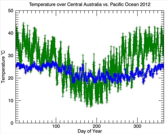
The simplest analysis is to plot a variable over time. This example plots a time series of air temperature from NCEP/DOE Reanalysis-II data (courtesy of NOAA). Each GRIB file represents a six-hour interval with 124 parameters, one per band. One year of data consists of 1,464 files.
e = ENVI()
series = ENVIRasterSeries('ReanalysisIIYear.series')
subrectAUS = [53, 45, 53, 45]
subrectPAC = [73, 45, 73, 45]
indices = LindGen(series.Count)
dataAUS = series.GetData(INDEX=indices, SUB_RECT=subRectAUS, BANDS=[68])
dataPAC = series.GetData(INDEX=indices, SUB_RECT=subRectPAC, BANDS=[68])
timeStamps = series.GetKey(INDEX=indices, KEY='TIME')
TimeStampToValues, timeStamps, YEAR=years, MONTH=months, DAY=days, $
HOUR=hours, MINUTE=minutes, SECOND=seconds
times = JulDay(months, days, years, hours, minutes, seconds)
time0 = JulDay(1, 0, years[0], 0, 0, 0)
times = (times - time0)
title = 'Temperature over Central Australia vs. Pacific Ocean 2012'
xTitle = 'Day of Year'
yTitle = 'Temperature !Eo!NC'
p1 = Plot(times, dataAUS, YTITLE=yTitle, XTITLE=xTitle, $
title=title,'-g2+', XRANGE=[1,365])
p2 = Plot(times, dataPAC, /OVERPLOT,'-b2+')
Result:
Power Spectrum
A power spectrum can identify periodic signals in data. The following example uses the IDL FFT function to calculate the power spectrum of air temperature over Australia using NCEP/DOE Reanalysis-II data:
e = ENVI()
series = ENVIRasterSeries('ReanalysisIIYear.series')
indices = LindGen(series.Count)
data = series.GetData(INDEX=indices, BANDS=[68], SUB_RECT=[53, 45, 53, 45])
timeStamps = series.GetKey(INDEX=indices, KEY='TIME')
TimeStampToValues, timeStamps, YEAR=years, MONTH=months, DAY=days, $
HOUR=hours, MINUTE=minutes, SECOND=seconds
times = JulDay(months, days, years, hours, minutes, seconds)
dt = times[1] - times[0]
power = FFT_PowerSpectrum(data, dt, PERIOD=period)
title = 'Power Spectrum of Surface Temperature over Australia'
xTitle = 'Period (days)'
yTitle = 'Power'
p = Plot(period, power, /YLOG, XRANGE=[0,10], XTITLE=xTitle, $
YTITLE=yTitle, TITLE=title )
Result:
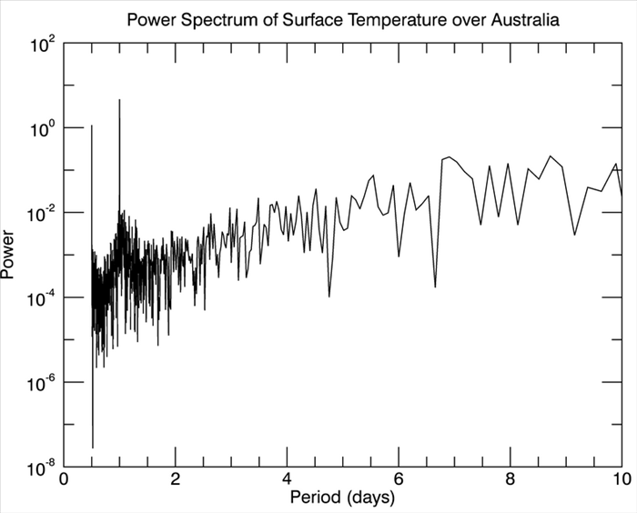
This plot shows two dominant periodic signals in the variation of temperature in a period range of less than 10 days. A diurnal signal (variation with a period of one day) and a semidiurnal signal with a period of half a day.
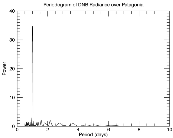
Lomb-Scargle Periodogram
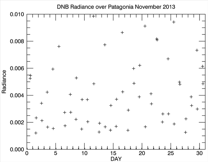
This type of periodogram is used for a frequency/period analysis of data that is not collected at a regular time interval or has missing data. The following example uses the IDL LNP_TEST function to calculate a Lomb-Scargle Periodogram from Suomi NPP VIIRS imagery (Day Night Band) in November 2013 over Patagonia.
e = ENVI()
series = ENVIRasterSeries('npp.series')
indices = LindGen(series.Count)
data = series.GetData(INDEX=indices, SUB_RECT=[610,515, 610, 515], BANDS=[0])
timeStamps = series.GetKey(INDEX=indices, KEY='TIME')
TimeStampToValues, timeStamps, YEAR=years, MONTH=months, DAY=days, $
HOUR=hours, MINUTE=minutes, SECOND=seconds
times = JulDay(months, days, years, hours, minutes, seconds)
times = (times - Min(times))
goodValues = Where(data ge 0)
data = data[goodValues]
times = times[goodValues]
title = 'DNB Radiance over Patagonia November 2013'
xTitle = 'DAY'
yTitle = 'Radiance'
p1 = Plot(times, data, '+', XRANGE=[0, 31], XTITLE=xTitle, $
YTITLE=yTitle, TITLE=title)
r = LNP_TEST(times, data, /DOUBLE, WK1=freq, WK2=normPeriodogram)
period = 1. / freq
title = 'Periodogram of DNB Radiance over Patagonia'
xTitle = 'Period (days)'
yTitle = 'Normalized Power'
p2 = Plot(period, normPeriodogram, XRANGE=[0, 10], $
XTITLE=xTitle, YTITLE=yTitle, TITLE=title)
Result:
The next periodogram shows a dominant 1-day period signal:
Space-Time Visualization
This type of analysis shows how an event evolves over space and time. The following example analyzes how the Normalized Difference Vegetation Index (NDVI) near the U.S. Great Lakes varies throughout a given year and from north to south. This information can be used to better understand growing seasons in the region.
e = ENVI()
series = envirasterseries('NDVI.series')
indices = LindGen(series.Count)
data = series.GetData(INDEX=indices, SUB_RECT=[4700, 0, 4700, 4800-1], BANDS=[0])
data = Reform(data)
timeStamps = series.GetKey(INDEX=indices, KEY='TIME')
TimeStampToValues, timeStamps, YEAR=years, MONTH=months, $
DAY=days, HOUR=hours, MINUTE=minutes, SECOND=seconds
times = JulDay(months, days, years, hours, minutes, seconds)
time0 = JulDay(1, 0, years[0], 0, 0, 0)
times = (times - time0)
ulm = series.GetKey(INDEX=[0], KEY='UPPER_LEFT_MAP')
ps = series.GetKey(INDEX=[0], KEY='PIXEL_SIZE')
latitudes = ulm[1] - FindGen(4800) * ps[1]
goodVal = Where(data ge 0, COMPLEMENT=misVal)
data[misVal] = !VALUES.F_NAN
title = 'Variation of NDVI as a function of time and latitude 2002'
xTitle = 'Day of Year'
yTitle = 'Latitude'
contourLevels = Findgen(10) / 10.
ct = COLORTABLE(72, /REVERSE)
c = Contour(data, times, latitudes, C_VALUE=contourLevels, $
XTITLE=xTitle, YTITLE=yTitle, TITLE=title, /FILL, $
XRANGE=[1, 365], YRANGE=[40, 50], RGB_TABLE=ct)
cb = Colorbar(TARGET=c, ORIENTATION=1)
The following plot shows the variation in NDVI as a function of latitude and time:
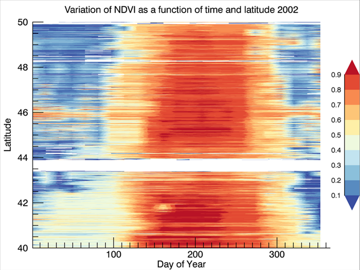
This plot reveals that the period of high NDVI values is shorter at higher latitudes. NDVI is lowest in winter and highest in summer. NDVI decreases earlier at high latitudes, and the decreasing signal then propagates south.