When pixel data are plotted in a scatter plot that uses image bands as plot axes, the spectrally purest pixels always occur in the corners of the data cloud, while spectrally mixed pixels always occur on the inside of the data cloud.
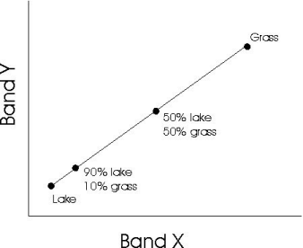
Consider two pixels, where one is in a park with uniform grass, and the other is in a lake. Now, consider another pixel that consists of 50 percent each of grass and lake. This pixel will plot exactly between the previous two pixels. Now, if a pixel is 10 percent filled with grass and 90 percent filled with lake, the pixel should plot much closer to the pixel containing 100 percent lake. This is shown in the following figure.
Now consider a third pixel that is 100 percent filled with sand. This pixel creates a third corner to the data cloud. Any pixel that contains a mixture of sand, water, and grass, will fall inside the triangle defined by connecting the three pure pixels together:
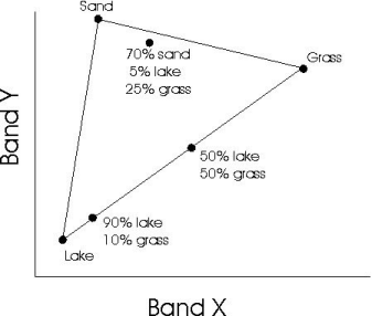
Any pixel that contains only two of the three materials falls on the edge of the triangle, but only the pure pixels fall in the corners of the triangle. In this example, the data cloud forms a triangle. This example considers only a 2D scatter plot with three endmembers, but even in scatter plots using any number of dimensions with data containing any number of endmembers, pure pixels always plot in the corners of the data cloud, and mixed pixels will fall within the shape defined by these corners.
Once you have started the N-Dimensional Visualizer, you can display scatter plots with as many dimensions as you have bands in your input image. When you display a scatter plot with more than three dimensions, you may notice that as the data cloud rotates, it occasionally folds in on itself in a manner that is difficult to comprehend. This is a result of plotting more dimensions than you can visualize. However, understanding the direction of the rotations is not necessary in order to derive useful information from the N-Dimensional Visualizer.
Unlike the Scatter Plot Tool, the N-Dimensional scatter plots are arranged so that the mean of each image band falls in the center of the plot. The origin of the scatter plot is therefore in the center of the data cloud.